Scoping & coordination
Defined scope, split tasks across the 3 of us, ran working sessions and design reviews.
Brief
Ornikar's product design team shared this challenge with us: Turn the booking journey into a real tool for pedagogical support and for projecting the whole training ahead
Ornikar is France's largest driving school by number of candidates, with over 5 million students supported:
Role & approach
We were 3 designers working together, and I naturally took on the senior role: framing the scope and coordinating the team.
Defined scope, split tasks across the 3 of us, ran working sessions and design reviews.
Led user test analysis and made every V1 → V2 design decision.
Owned onboarding, scheduling and lesson review flows, from ideation to HD mockups.
Analyzed the existing app + 4 user interviews + benchmark of scheduling apps
Insights collect + Problem framing → Design question + 4 success criteria
Ideate → Shape V1 (onboarding, scheduling, lesson review) + prototyping
Usability testing + iteration → V2 prototype + expected impact
The challenge
Students who don't plan ahead → sparse teacher schedules → fragile business.
“How might we help students organise their driving lessons simply, regularly and in advance, so we can better support them throughout their training?”
Research & discovery
Objective 1
Organisation
Objective 2
Motivation
Objective 3
Mentoring
Age 26
Matthieu
Age 30+
Maria
Age 20
Marie
Age 18
Maxine
Students don't know where they stand in their progress. The app doesn't help them visualise the path ahead.
Students are flexible with their schedule, as long as it serves their learning. A target exam date changes everything.
Consistency isn't natural, but once students see the link between regular sessions and exam success, they commit.
Our design question
How might we structure a driving learning experience where clarity of the journey and smart scheduling become the main drivers of student motivation?
Success criteria
01

Show the full learning journey at onboarding, with an estimated exam date.
02
Propose automatic scheduling to prevent drop-offs and long gaps between sessions.
03

Push students to book multiple sessions ahead rather than one at a time.
04

Steer students toward off-peak slots to balance teacher schedules.
Our solution
The changes this project brings to the app are significant and structural: they rework how students plan and follow their training.
Feature 01 → Onboarding
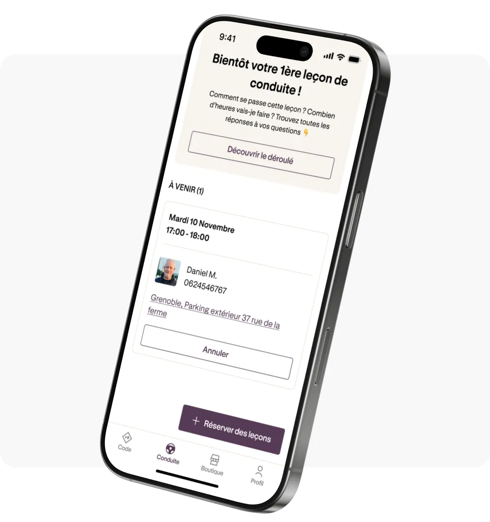
From the first drive hour, students set their weekly rhythm and auto-generate their schedule. The app proposes slots aligned with their availability and shows an estimated exam date from the start.
Feature 02 → Scheduling & Booking
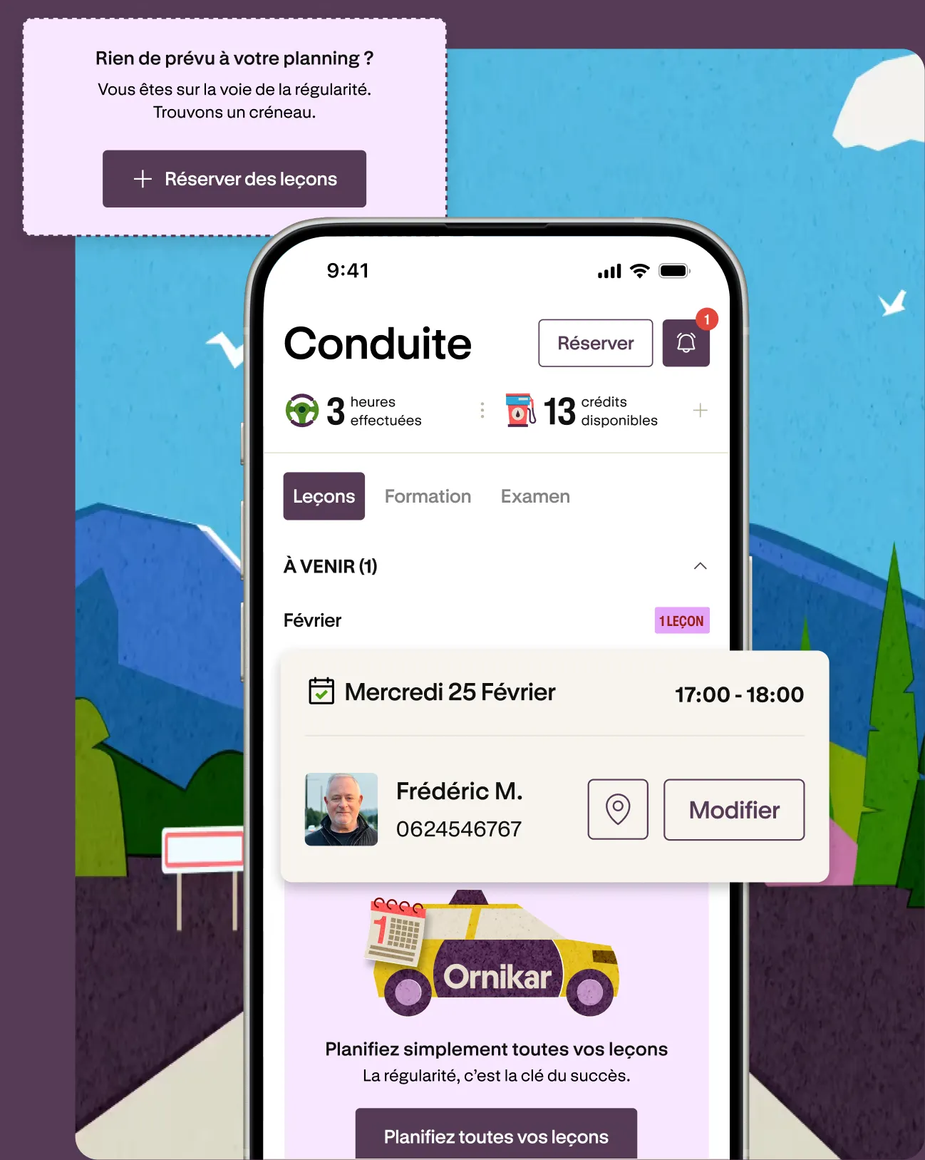
The student sees upcoming and past lessons plus their progress at a glance. Contextual nudges prompt them to book when their schedule runs dry. We moved the floating booking button to the top of the screen: with automatic scheduling it becomes secondary, and it would otherwise sit on top of the Modify buttons of upcoming lesson cards.
Feature 03 → Lesson review
After each lesson, the student accesses a full recap: skills covered, mastery level and a voice note from their instructor. Learning continues beyond the car. Only the latest lesson stays visible; earlier ones remain folded until the student expands past lessons.
Feature 04 → Notifications & Calendar sync
When an instructor moves or cancels a lesson, the student is notified right away and can accept or change the new time. They can also connect Google Calendar, so their lessons live in the environment they already use.
User testing
Every feature was tested, every friction point identified and corrected before the V2 final.
Onboarding
3/4 users didn't understand the slot selection in the booking modal.
Before
A list of available times with no visual hierarchy, recommended slots were hard to spot.
After
Structured time grid + 'Often available' badge on recommended slots.
Scheduling
2/4 confused by wording, 3/4 wanted to see rescheduled slots from their instructor.
Before
Generic 'Nothing planned' card with no date context or change information.
After
Card with time window + display of both old and new time when instructor reschedules.
Lesson review
4/4 didn't understand the lesson completion indicators.
Before
Numeric counters (2/2, 3/3) without context, audio feedback from instructor unnoticed.
After
Visual checkbox list + prominent play button for the instructor's audio feedback.
Expected impact
Expected effects, not results: the project was not shipped.
An estimated exam date and a planned schedule from the first lesson. Students see where they stand and keep a steady rhythm: fewer drop-offs, fewer long gaps between lessons.
Lessons booked in blocks and spread outside peak hours. Fuller, steadier schedules and fewer last-minute cancellations, with rescheduling handled in one tap.
Students who plan ahead book more hours in advance. Stable agendas mean more predictable revenue and a stronger answer to a very competitive market.
Outcome
Briefed directly by Ornikar's product design team on a live product challenge.
Part of the lesson review relies on a library of tutorial videos linked to each skill: it has to exist before the feature can ship.
Instructors need their own interface to send feedback on the student's work: voice notes and a selection of skills acquired or in progress.
After our final presentation, Ornikar's teams asked for access to our Figma file.